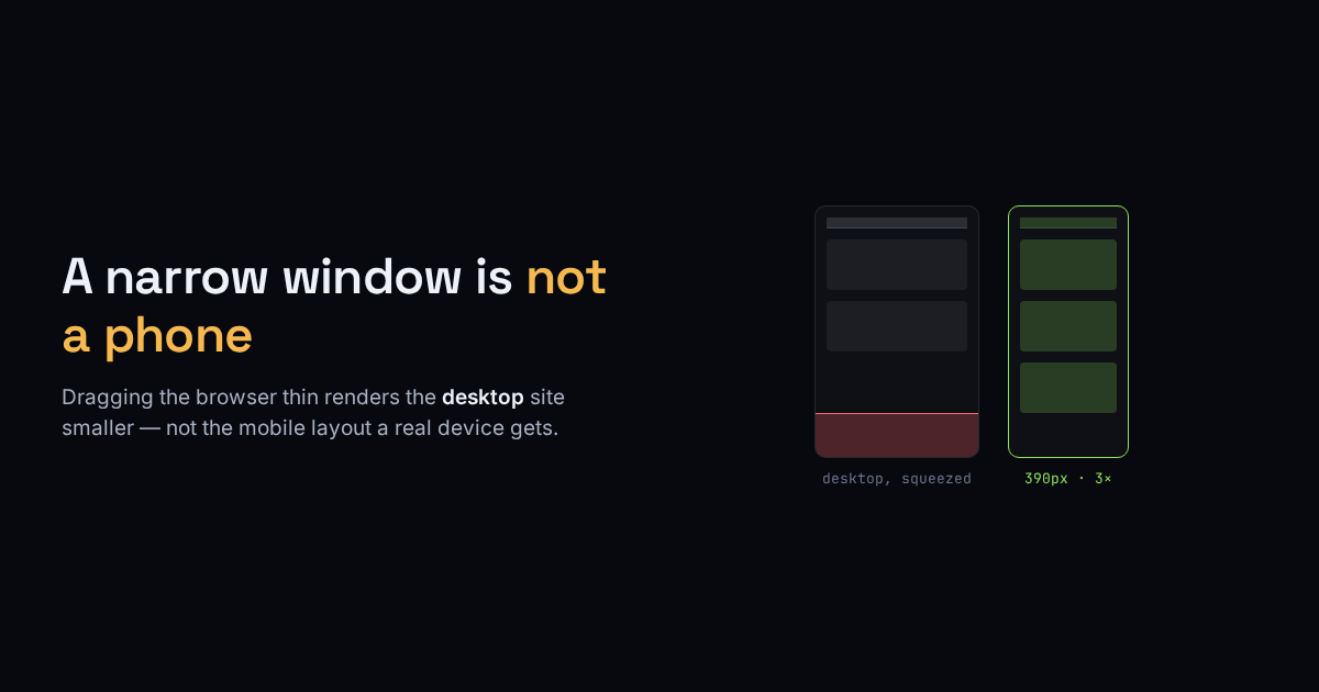
You need a picture of how a page looks on a phone — for a portfolio, a bug report, an app-store listing, a client sign-off. So you make the browser window skinny and take a screenshot. What you captured is the desktop site rendered at a smaller size, which is a different thing from the mobile site, and often it is not even close.
A responsive page decides its layout from the viewport width reported by the browser, through CSS media queries. A phone reports roughly 390 CSS pixels wide and a browser window reports whatever you dragged it to — but the window also keeps desktop behaviour a phone does not have, and the page can read the difference. Narrowing a desktop window frequently lands you in a half-broken middle state no real device ever shows.
Three things a real phone capture has that a narrow window doesn’t
- A mobile viewport, not a resized one. The layout has to be driven by a 390-ish-pixel viewport the way a phone sets it, so the mobile media queries fire — the stacked menu, the single column, the bigger tap targets.
- A device pixel ratio. Phones pack 2 to 3 physical pixels into each CSS pixel. A 390-pixel-wide iPhone screen is 1170 physical pixels across at 3×. Capture at 1× and the text and logos look soft and undersized compared to what a person actually sees; the DPR is what makes the image sharp.
- Time for the page to finish. Images below the fold load lazily, fonts swap in, and a cookie banner slides up a second after load. Fire the shutter too early and you get blank image boxes and a banner sitting across the content — the most common way an automated screenshot comes out wrong.
Why a service beats your own window
A headless browser can set the viewport to a real device size, set the device pixel ratio, wait for the network to settle, and capture both a phone and a desktop frame of the same URL in one go — consistently, the same every time, which your hand-dragged window is not. That is what our $1 site screenshot tool does: paste a public URL, get a clean mobile and desktop capture at the right width and pixel ratio, after the page has actually loaded.
The one thing no screenshot service can reach
It only sees what a stranger sees. A screenshot service loads the URL as an anonymous visitor, so anything behind a login — a dashboard, an account page, a checkout mid-flow, a members-only area — is not there to photograph. Give it a signed-in URL and it captures the login screen, honestly, because that is the page at that address for someone with no session. For anything gated, the only capture is the one you take on your own logged-in device.
So the split is clean: for any public page — a marketing site, a docs page, a listing, a competitor’s homepage — a service gives you a truer phone image than your own browser will, at the pixel density a real screen has. For anything behind your own login, nothing beats the screenshot button on the actual device.